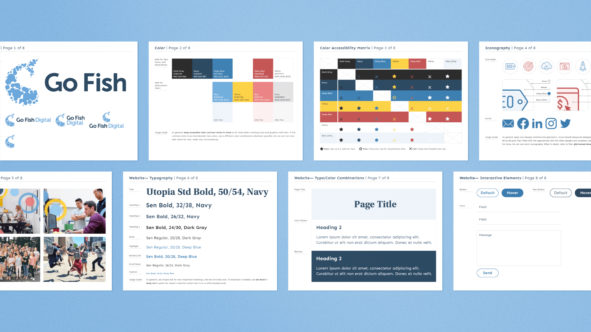
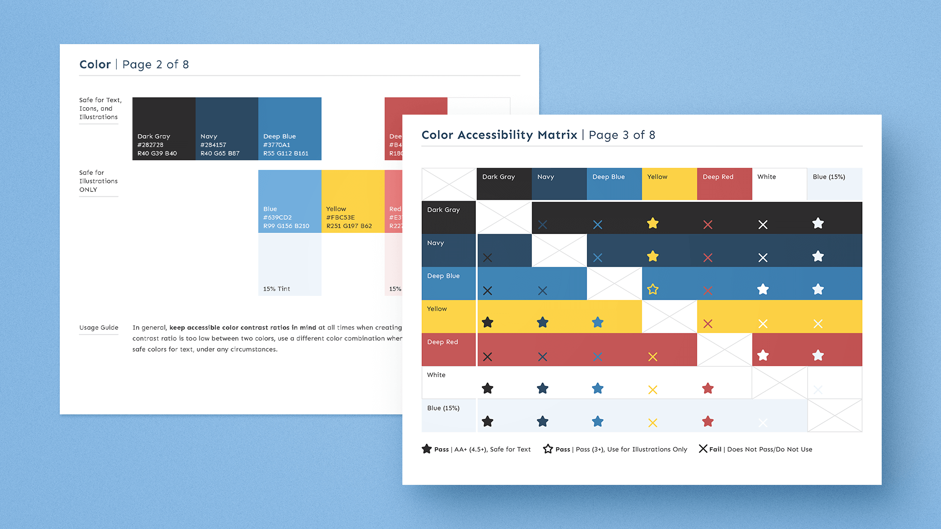
Developing WCAG Compliant Guidelines
Go Fish Digital’s brand colors did not meet web accessibility standards, and needed an update so my colleague Blake Compton could use them on the company website. I tweaked the existing colors to make them WACG AA compliant for both text and graphic elements, while maintaining the same visual balance throughout the palette.
Expanding the Icon Library
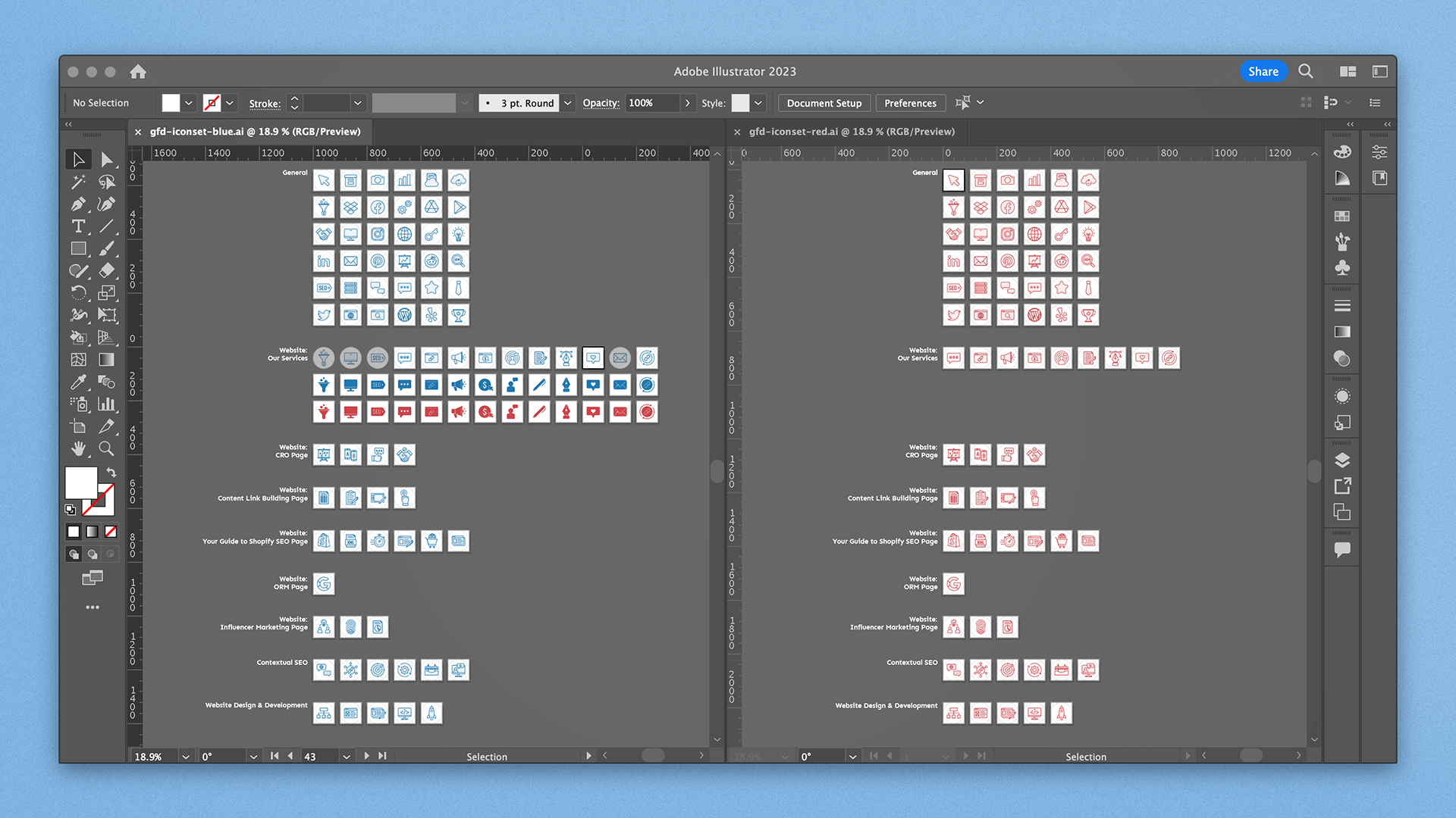
I redesigned the existing icons in Go Fish Digital’s asset library using the accessible color guidelines I established. Throughout the following year, I created more than 40 new icons to represent the company’s service offerings, as needed by the web development team.
Using the Style Guide
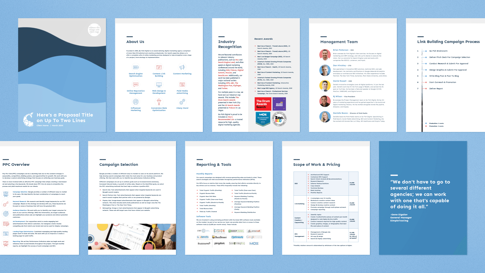
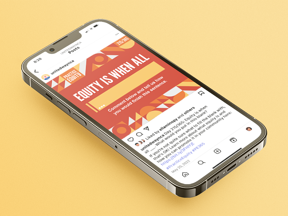
Once I published the completed style guide, I began applying it to various internal touchpoints, such as social media assets, website content, and presentation documents. For example, I redesigned the official Go Fish Digital client proposal template using the brand guidelines I developed.